
1. 스켈레톤 UI 란?
어떤 화면에 딱 들어왔을때, 데이터가 채워지기 전에는 사용자에게 빈 화면이 보여질 수 있다.
순간적으로 일어나는 일이지만, 빈 화면을 사용자에게 보여주는 건 사용자 경험을 떨어트리게 한다.

이 화면을 보게 되면 어떨까?
데이터가 로딩중이라는 생각보다는
사이트에 문제가 있다는 생각이 먼저 들것이다.

이럴때 빈 화면 대신
'데이터가 통신 중입니다~' 알려주는 대체화면으로
Progress Indicator 를 사용한다.
Progress Indicator는 시스템이 중단되거나 사용자 입력을 기다리고 있지 않음을 확인하기 위해 작업이 진행 중임을 사용자에게 알리기 위한 명령줄 인터페이스이다.
대강 말하면
지금은 화면에서 일하는 중이니
잠시만 기다려봐~ 하는 용도이다.


사이트마다 특성에 맞게 적용하기도 한다.
로딩 인디게이터의 종류로는 여러가지가 있지만
오늘은 그 중에서도 Skeleton UI를 알아보자.
스켈레톤 ui는 인스타, 유튜브, 카카오페이 등
모바일 앱에서 자주 활용되는 ui다.

데이터가 들어올 영역을 화면에서 미리 표시해 잡아주기 때문에
화면이 갑작스럽게 늘어나지 않고 사용자 입장에서도 친절하다.
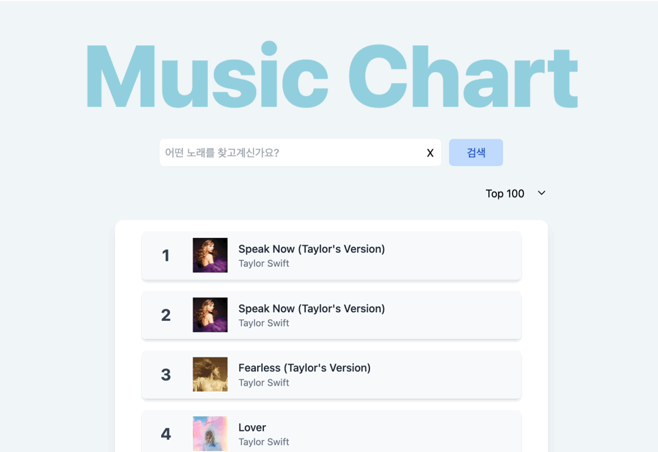
css 로 직접 만들어서 적용할 수 있지만 보다 간편하게 라이브러리를 사용해 아까 뮤직차트에 스켈레톤 ui를 적용해보자.
2. 설치방법
리액트로 만들어진 프로젝트에서 진행하였습니다.
//설치 방법
yarn add react-loading-skeleton3. 사용해보기
import Skeleton from 'react-loading-skeleton'
import 'react-loading-skeleton/dist/skeleton.css'
//최상단에서 css를 한번 임포트 해주자

<Skeleton /> // Simple, single-line loading skeleton
<Skeleton count={5} /> // Five-line loading skeleton
//여러가지 옵션으로 화면에 나타날 ui를 그려줄 수 있다.
//count는 나타낼 줄 수를 의미!
원래 사용중이던 스타일을 참고해 동일한 ui를 스켈레톤 컴포넌트로 만들어준다.
import Skeleton from "react-loading-skeleton";

const SkeletonMusicDiv = () => {
  return (
    <div className="my-2 flex h-[4.5rem] w-[90%] items-center rounded-md bg-slate-50 p-1 shadow-md hover:bg-slate-100">
      <Skeleton width="3.2rem" height="3.2rem" className="ml-[4.5rem]" />
      <div className="mx-2">
        <Skeleton width="15rem" height="1.2rem" />
        <Skeleton width="6rem" />
      </div>
    </div>
  );
};

export default SkeletonMusicDiv;

//테일윈드를 사용하고 있던 프로젝트라 같이 사용했다.


스켈레톤 UI를 이용해 기존에는 비어있던 화면에 어디 부분이 어떻게 채워질지 미리 표시할 수 있다.
'JS > Library' 카테고리의 다른 글
| 보안 : react-cookie (0) | 2023.12.05 |
|---|---|
| CSS : styled-components (스타일드 컴포넌트) (1) | 2023.11.26 |